.svg)
Subscribe to our newsletter and get insights on how to grow your personal brand.
Thank you! Your submission has been received!
Oops! Something went wrong while submitting the form.
.svg)


Your profile photo is probably doing less for you than you think. Maybe it's an old conference shot. Maybe it's cropped from a wedding. Maybe it's technically clear, but it doesn't say “founder,” “operator,” or “trusted expert.” It just says you uploaded something and moved on.
That's a mistake.
If you're building a company, raising capital, hiring senior talent, selling into enterprise accounts, or growing your reputation online, your photos aren't cosmetic. They're business assets. The right image sharpens trust before you ever speak. The wrong one creates friction you'll never get to measure directly, because the prospect scrolls past, doesn't reply, or forgets you.
Most executives treat a photoshoot like a one-time task. I think that's backwards. You should treat it like a brand system. You need images that work across LinkedIn, your website, podcasts, speaker pages, newsletters, press requests, and social posts. You need consistency. You need range. You need shots that make you look like the person your market should already trust.
Your headshot isn't a vanity item. It's your most compressed brand signal.
A founder's audience makes fast judgments. They see your face before they read your credentials, your pitch, or your company story. That image tells them whether you look current, credible, approachable, sharp, tired, generic, polished, or forgettable. If you're serious about personal brand growth, your photo needs to carry real weight.
![]()
The clearest proof comes from LinkedIn. Profiles featuring professional headshots receive 21 times more profile views and 36 times more messages compared to those without photos. Professional-quality headshots also boost views by an additional 14 times over amateur images, according to LinkedIn headshot data summarized here.
That should end the debate.
If your profile photo is weak, you're not just missing aesthetic points. You're reducing visibility and lowering the odds that the right people start conversations with you. For founders, those conversations can mean investors, clients, press, recruiting wins, and partnerships.
Practical rule: If your photo doesn't look like the current version of the leader people will meet on a Zoom call, it's already out of date.
People rarely remember a polished bio paragraph. They remember a face. They remember whether it looked trustworthy and aligned with the role. That's why I tell clients to stop thinking “headshot” and start thinking visual identity.
A strong professional photo does four jobs at once:
If you want a practical reference before your shoot, review 8 professional headshot essentials from Secta Labs. It's useful because it reinforces the basics executives often ignore, especially framing, expression, wardrobe, and background choices.
One polished image isn't enough. You need a photo set that supports the full ecosystem of your brand. That means a primary headshot, a secondary profile image, horizontal crops for press, room for text overlays, and a few lifestyle images that still look intentional.
That's the core of good professional photo guidelines. They aren't about pleasing a photographer. They're about making sure every image you publish earns its place.
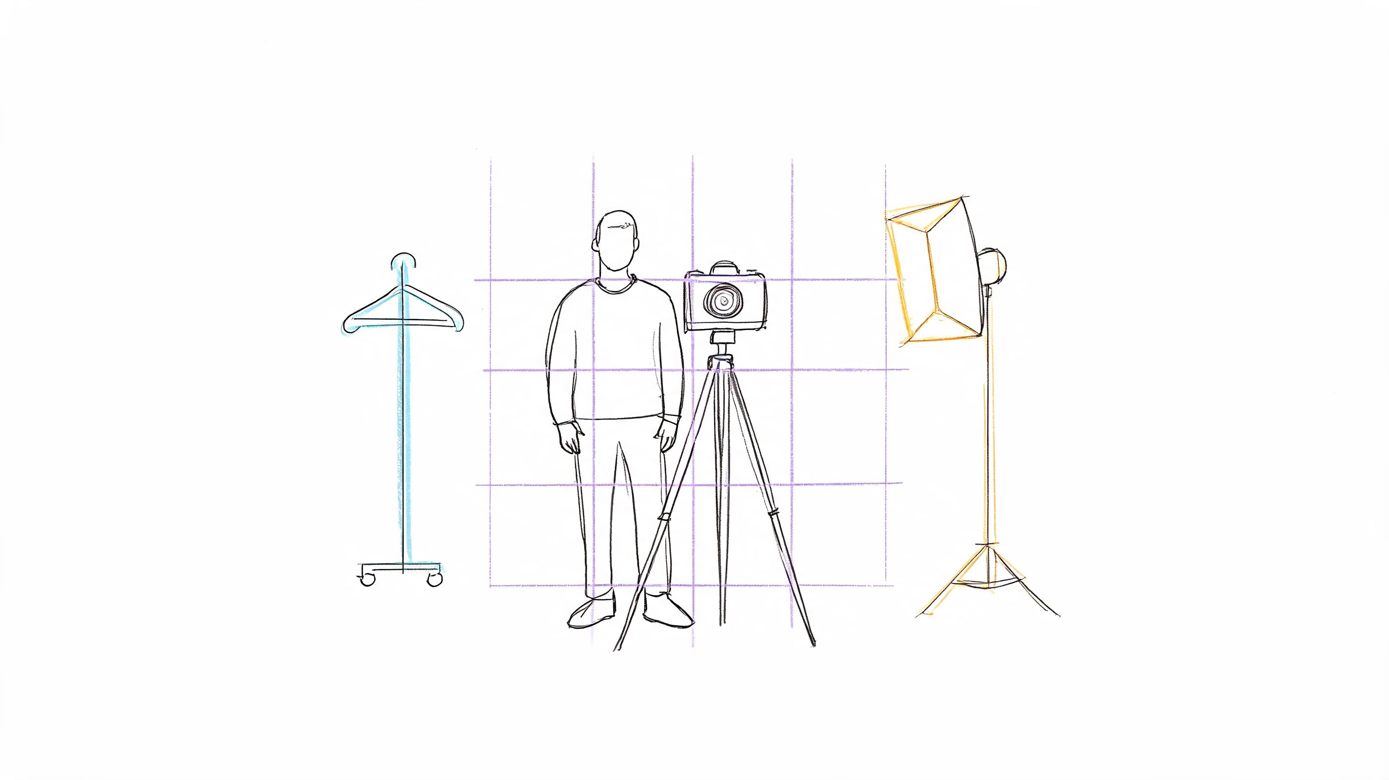
Bad shoots usually fail before the camera comes out.
The problem isn't lighting. It isn't gear. It's that the founder shows up with no brief, no visual direction, and no idea what the photos need to accomplish. Then they get a gallery full of decent images they'll never use.
Your photoshoot needs a brand mandate. Not a mood board for fun. A clear operating document.
If you can't answer what the photos are for, you're not ready.
Your brief should include these five points:
Your role in plain language
Don't write “visionary leader.” Write what people hire or trust you for. B2B SaaS founder. Private equity operator. Executive coach. Agency CEO. Technical founder selling to enterprise teams.
The audience you need to influence
Investors respond to different signals than podcast hosts or mid-market buyers. Define the primary audience first.
The adjectives the photos must communicate
Pick three. Examples: calm, sharp, credible. Or modern, ambitious, approachable. Or premium, authoritative, understated.
Where the images will live
LinkedIn, website About page, media kit, Substack, conference bio, webinar registration pages, social graphics.
What should be avoided
Too corporate. Too casual. Too startup cliché. Too stiff. Too trendy. Too “personal brand influencer.”
If you're still clarifying your broader positioning, read this guide on how to develop your personal brand and stand out online. Your photo direction should match that strategy, not fight it.
Most founders blend styles that don't belong together. Formal suit in one frame. Hoodie in the next. Moody editorial lighting for LinkedIn. Bright coworking-space smiles for investor materials. That inconsistency weakens trust.
Pick one primary lane.
| Style lane | Best for | What to wear | Best backdrop |
|---|---|---|---|
| Approachable expert | Consultants, coaches, service founders | Structured jacket, open collar, clean knitwear | Neutral studio, tidy office |
| Formal authority | Finance, legal, enterprise leadership | Suit, dress shirt, restrained accessories | Studio gray, dark neutral interior |
| Modern operator | SaaS founders, startup executives | Minimal layers, sharp casual tailoring | Office, architectural background |
| Creative strategist | Content-led brands, creators, agencies | Elevated personal style, simple textures | Lifestyle environment, controlled natural light |
Bring options, but don't bring your entire closet. I prefer three categories:
Keep clothes fitted, pressed, and simple. Avoid loud patterns, novelty textures, and anything that dates the image fast. Your face should lead the frame, not your blazer lining.
The best wardrobe choice is usually the one that looks most like you on your best workday.
A studio background works because it removes distraction. An office works if it reflects your role. A hotel lobby usually looks generic. A random brick wall is almost always lazy.
Use these filters when choosing location:
If event coverage is part of your wider asset strategy, this piece on capturing professional event images in NZ is worth reviewing because it shows how context, candid moments, and brand environment shape usable business photography.
One more thing. Planning matters because image performance compounds across your brand. Content paired with relevant, high-quality photos is 6.5 times more memorable and gets 94% more views than content without, based on photography marketing data summarized here. If your brand runs on content, your photos need to be built for content.
Most founders think they're bad on camera. Usually they're not. They're just under-directed.
You don't need to become photogenic. You need a repeatable set of physical cues that make you look like yourself on a strong day, not a tense version of yourself trying to “do a headshot.”
Your expression falls apart when your posture is off. If your shoulders rise, your neck disappears. If your chin pulls back, you look hesitant. If you face the camera straight on in every frame, you'll look flat.
Use this setup instead:
These aren't photographer tricks. They're executive presence mechanics.
A warm smile is useful. It isn't always the right answer.
If you sell trust-heavy services, hire senior talent, or want to appear approachable, use a real smile with energy in the eyes. If you're positioning as a decisive operator or strategic advisor, aim for calm focus rather than a broad grin. If you're doing both, you need both.
I always recommend founders leave with three expression categories:
If you're refining the broader signals your image sends, this article on building personal brand for influence will help you connect your visual choices to your authority online.
Straight-on isn't automatically best. It's just common.
A 2025 study analyzing 10,000 LinkedIn profiles found that headshots using face-shape-specific angles received 42% more profile views and 28% higher connection acceptance rates compared to generic straight-on shots, according to this analysis of best headshot angles.
That means you should test angles deliberately, not guess.
Here's the simplest executive version:
| Face shape tendency | Better starting angle |
|---|---|
| Rounder face | Slight three-quarter turn |
| Strong square jaw | Slight upward lift and softer angle |
| Oval face | Mild turn, usually within a modest range |
| Longer face | Avoid exaggerated downward camera positions |
Ask the photographer to shoot short series with small changes, not dramatic pose resets. Tiny shifts often produce the strongest difference.
Here's a solid visual walkthrough to calibrate how small pose changes affect the frame:
You don't need technical jargon. You need a few sharp prompts:
A founder who can direct a shoot in plain English gets better assets than one who just hopes the photographer reads their mind.
You don't need to know camera settings. You do need to know when a photo looks expensive and when it looks amateur.
The difference usually comes down to light and composition. If you understand those two, you can approve a setup faster, reject weak proofs with confidence, and ask for adjustments before the session drifts into useless territory.
Good light is soft, controlled, and flattering without being fake. It defines your face clearly. It doesn't create harsh shadows under the eyes, shiny hotspots on the forehead, or blown-out patches on the skin.
Bad light usually shows up in one of three ways:
If the light makes your skin texture look aggressive or your eyes look lifeless, stop and adjust. Don't assume retouching will save it. It won't fix a weak setup.
A strong founder photo tells the viewer where to look first. That means your face should lead. Background elements should support, not compete. Cropping should feel intentional. You should have enough variation to use the image across different placements.
One useful benchmark is the rule of thirds. For headshots, placing the eyes on the upper intersection of the rule-of-thirds grid can boost visual retention by 35% compared to centered shots, based on headshot composition guidance here.
That matters because memorability is part of brand performance.
If your eyes are the focal point and the frame feels balanced, the image usually earns a second look.
Different backgrounds send different signals:
| Background type | What it communicates | Best use |
|---|---|---|
| Neutral studio | Clarity, focus, professionalism | LinkedIn, website, press kit |
| Office environment | Real-world leadership context | About page, media features |
| Architectural exterior | Modernity, ambition, editorial feel | Founder branding, social assets |
| Soft blurred lifestyle setting | Approachability, accessibility | Newsletter, community-facing content |
The best professional photo guidelines are simple here. If the background adds authority, keep it. If it adds clutter, kill it.
Most people waste good photos by uploading one to LinkedIn and forgetting the rest.
That's sloppy. Your shoot should feed your entire brand engine. Every image needs a role. Some are for identity. Some are for conversion. Some are for distribution. If you don't deploy them deliberately, you paid for potential and got very little return.
After the shoot, sort your final selects into four buckets:
Each image should answer one question. Where does this go, and why does it belong there?
If your LinkedIn profile is a priority, this guide on how to increase profile views on LinkedIn pairs well with a stronger visual identity because profile optimization works better when the photo itself carries authority.
Your profile image should be the clearest and most recognizable version of you. Don't get cute with it. No dramatic side profile. No tiny full-body crop. No conference stage photo where your face is half shadow.
Your website About page can handle more texture. Use a stronger editorial portrait or an environmental image that says something about how you work. Speaker pages often benefit from a more energetic shot. Newsletter headers need horizontal space. Social assets need variation so your brand doesn't look repetitive.
Here's the practical cheat sheet I recommend using.
| Platform | Placement | Recommended Dimensions (pixels) | Aspect Ratio |
|---|---|---|---|
| Profile photo | 800 x 800 | 1:1 | |
| Banner image | 1584 x 396 | 4:1 | |
| Website | About page portrait | 1200 x 1500 | 4:5 |
| Website | Hero image | 1600 x 900 | 16:9 |
| X | Profile photo | 800 x 800 | 1:1 |
| Profile photo | 800 x 800 | 1:1 | |
| Feed portrait | 1080 x 1350 | 4:5 | |
| Story cover or vertical asset | 1080 x 1920 | 9:16 | |
| Speaker kit | Headshot | 2400 x 3000 | 4:5 |
| Newsletter | Header image | 1200 x 675 | 16:9 |
These are practical working dimensions, not hard laws. The main point is consistency, clarity, and having enough resolution to crop without destroying quality.
AI can help you choose better-performing images. It can also push you toward fake-looking nonsense if you hand over all judgment.
One useful application is testing angle and authority signals. Emerging AI tools show that low-angle shots, roughly 5 to 10 degrees below eye level, can boost the perceived leadership qualities of SaaS founders by 22% in B2B contexts, based on this discussion of low-angle photography and AI optimization.
That doesn't mean every founder should suddenly use a hero shot from below. It means you should test whether a slightly lower camera perspective strengthens your presence in a way that still looks natural.
Use AI for three tasks only:
Don't use AI to replace your face with a polished stranger. You're building trust, not a synthetic avatar.
A great image can still become a problem if you don't control how it's used.
Most founders assume payment equals ownership. It often doesn't. In many cases, you're buying a license to use the photos under certain terms. If you want to run paid ads, share the images with media outlets, hand them to event organizers, or give them to your design team for commercial collateral, make sure the agreement allows that.
Get clear answers on these points in writing:
If your company team or event attendees appear in branded imagery, you may also need proper releases and internal consent procedures. That's basic brand protection.
If you publish photos online, write alt text that describes the image clearly and usefully. Don't stuff it with keywords. Don't write “image of founder.” Describe what matters to a person using a screen reader.
Better alt text sounds like this: professional headshot of a SaaS founder in a navy blazer against a neutral gray background.
If you're evaluating authenticity and image ethics in a world of manipulated visuals, how AI Image Detector approaches ethical investigation is a useful reference point. The broader lesson is simple. Your visual brand should be accurate, defensible, and respectful.
Clear rights and accessible publishing practices protect your reputation long after the shoot ends.
Update them when your appearance, role, or market position has clearly changed. If you've changed your hairstyle, glasses, body composition, wardrobe standard, or brand positioning, your images should catch up. I also recommend replacing any photo that no longer matches how you show up on video calls, stages, or client meetings.
You don't need constant reshoots. You do need current representation.
You can. I usually wouldn't recommend it as your primary brand image.
AI headshots are useful for experimentation, mockups, and testing style directions. They're weak when they smooth away the human details that make you believable. If you use AI at all, use it to refine concepts, compare crops, or test presentation styles before or after a real session. Your main public-facing identity should still look like the person people will meet.
Budget based on business use, not on getting the cheapest photographer with a camera.
A founder needs more than a single headshot. You need planning, wardrobe guidance, strong direction, multiple setups, useful crops, and licensing that supports real business use. Ask what's included, how many finals you'll receive, whether commercial usage is covered, and whether the photographer understands executive branding. If they can't talk fluently about where these images will be used, keep looking.
If your photos don't match the level you're operating at, fix that before you publish another month of content. Legacy Builder helps founders and executives turn their expertise into a clear, credible online brand, with the strategy, content, and visual positioning needed to make that presence work.


You could – but most in-house teams struggle with the nuance of growing on specific platforms.
We partner with in-house teams all the time to help them grow on X, LI, and Email.
Consider us the special forces unit you call in to get the job done without anyone knowing (for a fraction of what you would pay).
Short answer – yes.
Long answer – yes because of our process.
We start with an in-depth interview that gives us the opportunity to learn more about you, your stories, and your vision.
We take that and craft your content then we ship it to you. You are then able to give us the final sign-off (and any adjustments to nail it 100%) before we schedule for posting.
No problem.
We have helped clients for years or for just a season.
All the content we create is yours and yours alone.
If you want to take it over or work on transitioning we will help ensure you are set up for success.
We want this to be a living breathing brand. We will give you best practices for posting and make sure you are set up to win – so post away.
Subscribe to our newsletter and get insights on how to grow your personal brand.