.svg)
Subscribe to our newsletter and get insights on how to grow your personal brand.
Thank you! Your submission has been received!
Oops! Something went wrong while submitting the form.
.svg)


In a world saturated with digital noise, email remains one of the most direct and powerful channels for building a brand. Getting into the inbox is only half the battle. To truly connect, convert, and build a loyal audience, your emails must be more than just text on a screen; they need to be an experience. This means embracing strategic design that captures attention, guides the reader, and feels authentically yours.
Many professionals, from emerging entrepreneurs to established CEOs, struggle to translate their powerful stories into effective email formats, often leading to low engagement and missed opportunities. This guide demystifies the process by breaking down the 10 most critical email design best practices for building a memorable brand. We'll move beyond generic advice to provide actionable, data-backed strategies, complete with real-world examples and implementation tips you can apply immediately. While these design principles are universal, applying them in a business context requires a specific approach; understanding B2B Email Marketing Best Practices is crucial for boosting engagement and results in professional settings.
This article will show you exactly how to implement:
Whether you're aiming to increase conversions, improve readability, or simply create emails that people love to open, these principles will provide the blueprint for building a lasting connection, one well-designed email at a time. Let's get started.
Adopting a mobile-first approach is one of the most critical email design best practices for modern marketing. With over half of all emails now opened on mobile devices, designing for the smallest screen first is no longer optional; it’s a necessity. This method involves creating a layout for a mobile viewport and then progressively adding complexity and features for larger screens like tablets and desktops. It ensures the core message, key visuals, and primary calls-to-action (CTAs) are clear and functional, even on the go.
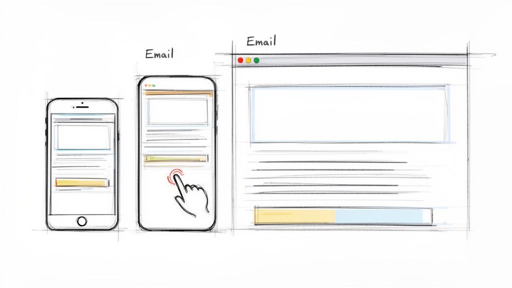
For busy professionals and founders checking their inbox between meetings, a broken or hard-to-read email is an immediate delete. Platforms like Mailchimp and HubSpot have built their template frameworks around this principle, ensuring that layouts reflow gracefully from a single column on mobile to multiple columns on desktop. The result is a consistent and accessible experience, regardless of where your audience is reading.
A mobile-first strategy forces you to prioritize. You must identify the most essential elements of your message and place them front and center. This inherent constraint leads to cleaner, more focused emails that perform better across all platforms, not just mobile. It respects the user's time and context, building trust and improving engagement.
Mobile-first design isn’t just about making things smaller. It’s a strategic choice to focus on clarity and accessibility, which benefits every user on every device.
To put this into practice, follow these actionable guidelines:
For a deeper technical dive into responsive email coding, this video offers excellent visual guidance:
Implementing a clear visual hierarchy is one of the most fundamental email design best practices for guiding readers through your content. It uses design principles like size, color, whitespace, and positioning to direct attention to the most important elements first. For busy professionals who scan emails rather than read them word-for-word, a strong structure ensures your primary message and call-to-action are immediately visible and understood, preventing your email from getting lost in a crowded inbox.
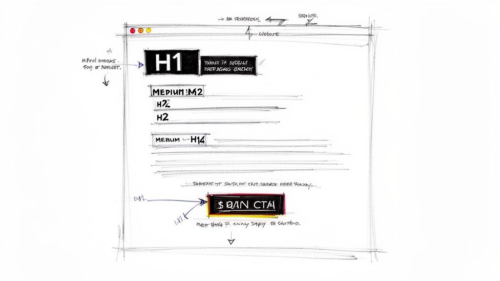
This approach respects the reader’s time by making information digestible. Think of newsletters from Medium or Substack; they organize stories using prominent headlines and distinct sections, allowing you to quickly find what interests you. Similarly, LinkedIn’s newsletters use a strong subject-driven structure that draws the eye down the page logically from one point to the next, a method popularized by UX pioneers like the Nielsen Norman Group.
A well-defined hierarchy turns a wall of text into a scannable, intuitive guide. It tells the reader’s brain what to look at first (the headline), what to consider next (the key benefit), and what to do (click the CTA). This clarity reduces cognitive load, making the user’s experience feel effortless and efficient, which directly translates to higher engagement and conversion rates.
Visual hierarchy isn’t just about making an email look good; it’s about making your message easy to comprehend in seconds. It’s the silent conductor of your reader’s attention.
To create a strong visual hierarchy in your own emails, apply these direct guidelines:
Effective personalization goes far beyond inserting a subscriber's first name. This email design best practice involves using dynamic content to change parts of an email based on recipient data, behavior, or engagement history. For professionals building a personal brand, this approach creates individual connections by making each reader feel the message was crafted specifically for them, boosting relevance and interaction.
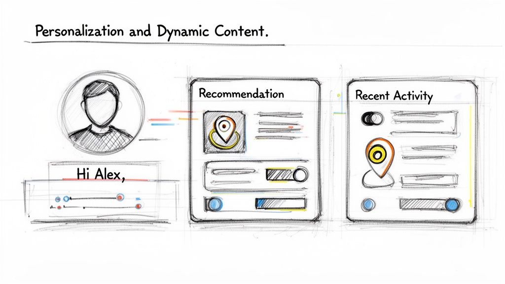
Think of Amazon’s product recommendations or Netflix’s content suggestions; they are prime examples of this strategy in action. Email platforms like Klaviyo and HubSpot allow you to show or hide entire content blocks based on segmentation rules. This means a new subscriber might see a welcome offer, while a loyal customer sees an exclusive preview, all within the same email campaign.
Personalization makes your audience feel seen and understood. Instead of receiving a generic blast, they get content that speaks directly to their interests, purchase history, or stage in the customer journey. This builds a powerful sense of connection and demonstrates that you value their individual relationship with your brand, which is a cornerstone of authentic brand-building.
Dynamic content transforms a monologue into a dialogue. It shows you’re listening to your audience's actions and responding with relevant information, not just broadcasting a one-size-fits-all message.
To successfully integrate personalization, consider these steps:
While not strictly part of the visual layout, the subject line is the gatekeeper to your email’s content and a fundamental component of your overall email design best practices. It’s the first impression you make in a crowded inbox and directly determines whether your carefully designed email gets opened. A great subject line sparks curiosity, clearly communicates value, and stays true to your brand voice, all before a single pixel of your email is even seen.
For professionals and founders, the subject line is a critical extension of their personal brand. It must be compelling without resorting to cheap clickbait. Think of the authentic, benefit-driven lines used by leaders like Tim Ferriss (“This changed my entire approach to productivity”) or the data-backed curiosity from Neil Patel (“[Data] shows X causes Y (here's why)”). These examples promise real value, encouraging opens based on trust and relevance, not manipulation.
A powerful subject line functions as a promise. It tells the reader exactly what they stand to gain by investing their time, setting clear expectations from the start. This approach respects your audience and builds a relationship founded on delivering genuine insight, not just chasing a click. When your subject lines consistently deliver on their promise, subscribers learn to trust you, leading to higher open rates and deeper engagement over time.
Your subject line isn’t just a title; it’s a strategic handshake. It should be firm, confident, and genuine, inviting the reader into a conversation they actually want to have.
To craft subject lines that command attention and drive opens, integrate these proven tactics:
To master the art of writing compelling subject lines that get opened every time, you can learn more about crafting email subject lines that get opened every time.
Your call-to-action (CTA) is the crucial link between your email's message and the action you want your reader to take. Strategic CTA design is one of the most important email design best practices because it directly guides your audience toward conversion, whether that’s reading a blog post, joining a community, or making a purchase. An effective CTA is visually distinct, uses clear, action-oriented language, and is placed where the user is most likely to act.
For personal brand builders and founders, CTAs are the primary mechanism for audience engagement and growth. Platforms like Substack and ConvertKit have built their success on making CTAs impossible to miss, using prominent, high-contrast buttons for actions like "Subscribe" or "Learn More." The goal is to remove all friction and ambiguity, making the desired next step obvious and easy for your reader to take.
A well-designed CTA provides a clear path forward for an engaged reader. Instead of leaving them to wonder what to do next, you present a logical, compelling option that aligns with the email's content. This clarity reduces decision fatigue and significantly increases the likelihood of a reader taking your desired action. It transforms passive reading into active participation, which is fundamental to building a loyal audience or customer base.
A great CTA doesn't just ask for a click; it completes the reader’s thought. It should feel like the natural and satisfying conclusion to the message they just consumed.
To create CTAs that convert, apply these practical guidelines:
Creating accessible and inclusive emails is a core component of modern email design best practices. This approach ensures that all recipients, including those with visual, auditory, motor, or cognitive disabilities, can easily read and interact with your content. It involves a thoughtful application of design and code, such as providing sufficient color contrast, writing descriptive alt text for images, and using semantic HTML. Making your emails accessible is not just about compliance; it expands your reach and demonstrates a fundamental respect for every member of your audience.
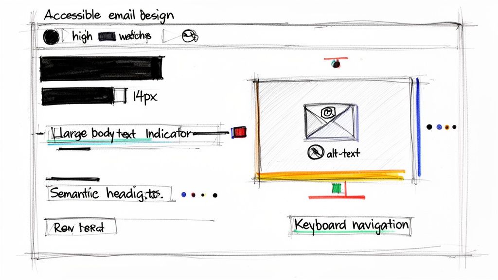
For brands built on trust and authenticity, inclusive design is non-negotiable. Major platforms like Microsoft and Google have integrated accessibility into their products, with features like screen reader support in Gmail and semantic structure in Office 365. Similarly, an AARP email is a masterclass in readable typography, proving that clarity and accessibility serve everyone, not just a specific subset of users.
An accessible email is a more effective email for everyone. Principles like clear typography, logical structure, and descriptive links improve usability for all readers, regardless of ability. This practice reduces friction, builds brand loyalty, and ensures your message isn't lost due to a technical barrier. It aligns your marketing efforts with a people-first philosophy, showing your community that you value their experience.
Accessibility isn’t a feature or an add-on; it’s a foundational mindset that makes your communication more human and effective. It’s about including everyone in the conversation.
To make your emails more accessible, integrate these actionable steps into your workflow:
<H1> for the main heading and proper heading hierarchy, to help screen readers navigate the content.While visual layout is crucial, what truly drives results is delivering a message that resonates. This is where strategic segmentation becomes one of the most powerful email design best practices. It involves dividing your audience into smaller, specific groups based on demographics, behaviors, or interests. Instead of sending a generic, one-size-fits-all email, you can send highly relevant content that speaks directly to each group's needs and motivations.
For professionals and founders, this means you can address different audience segments with precision. A new subscriber might receive a welcome series, while a long-time customer could get an exclusive offer. Platforms like Klaviyo and ConvertKit excel at this, allowing you to create segments based on everything from purchase history to how a subscriber joined your list, ensuring every message feels personal and valuable.
Segmentation transforms email from a broadcast channel into a conversation. When a subscriber receives content that aligns with their specific context, they feel understood and are far more likely to open, click, and convert. This relevance builds trust and loyalty, turning casual followers into dedicated advocates for your personal brand or business. It respects your audience's inbox and acknowledges their unique relationship with you.
A well-segmented email list is the difference between shouting into a crowd and having a meaningful one-on-one conversation. Relevance is the key to unlocking engagement.
To start using segmentation effectively, apply these practical guidelines:
For a deeper look into the process, you can learn how to segment email lists for higher engagement with this detailed guide.
Images are essential for conveying a personal brand's story and capturing attention, but they come with a performance cost. One of the most important email design best practices is to optimize every image for both speed and accessibility. This means compressing files to reduce load times, choosing the correct format, and critically, providing descriptive alternative (alt) text for every visual. Heavy, unoptimized images can make an email painfully slow to open, especially on mobile networks.
This practice is crucial because email clients handle images differently. While Apple Mail often displays images automatically, Gmail and many Outlook versions block them by default, requiring the recipient to opt-in. Without proper alt text, these blocked images leave behind empty boxes, creating a broken and confusing experience. For creators and founders, where visual identity is paramount, ensuring images load fast and have a fallback is non-negotiable.
Image optimization directly impacts user experience and deliverability. Fast-loading emails reduce abandonment rates and keep readers engaged. Meanwhile, alt text serves two vital functions: it provides context when images are blocked and makes your content accessible to subscribers using screen readers. This commitment to inclusivity builds trust and broadens your audience reach, reinforcing a positive brand perception.
Alt text is not just a fallback; it's a fundamental part of your email's content. It ensures your message is understood by everyone, regardless of how they access their inbox.
To effectively optimize your email images, integrate these steps into your workflow:
Designing a beautiful email is only half the battle; knowing how it performs is what drives real growth. This is where analytics and testing become foundational email design best practices. Success in email marketing isn't a one-time setup but a continuous cycle of measuring, learning, and refining. By tracking key metrics and methodically testing different elements, you can turn guesswork into a data-driven strategy that consistently improves results.
Platforms like HubSpot and Klaviyo provide powerful analytics dashboards that go beyond simple open and click rates. They can track revenue attribution, subscriber engagement patterns, and even predict future behavior. This data is invaluable for personal brand builders and founders who need to ensure every email sent is not just opened, but is also moving their audience closer to a conversion.
A commitment to analytics and A/B testing removes ego and assumptions from your marketing efforts. You might believe a certain image or call-to-action is perfect, but the data may reveal your audience responds differently. This process of continuous optimization ensures your content evolves with your audience's preferences, leading to higher engagement, lower unsubscribe rates, and a stronger return on investment.
Data-driven design isn't about chasing vanity metrics. It’s about understanding user behavior to create more valuable and effective communication.
To build a culture of continuous improvement, integrate these testing habits into your workflow:
While visual elements are crucial, the words you use are the soul of your email. One of the most impactful email design best practices is to develop compelling copy with an authentic brand voice. This approach moves beyond sterile corporate-speak and embraces a genuine, conversational tone that reflects the sender’s personality. It’s about building a real connection, not just broadcasting a message.
For founders and professionals building a personal brand, your email copy should feel like a direct conversation with someone who knows and trusts you. Think of emails from creators like Seth Godin or Tim Ferriss; their writing is distinctive and personal, making subscribers feel like they are part of an inner circle. This authenticity builds trust, fosters an emotional connection, and keeps your audience eagerly anticipating your next message.
Authentic copywriting cuts through the noise of a crowded inbox. When your voice is genuine, it resonates on a human level, making your message more memorable and persuasive. People buy from people they like and trust. By shedding corporate jargon and sharing personal stories or direct insights, you create a loyal following that values your perspective, not just your product or service.
Your email copy is your brand’s personality distilled into words. An authentic voice doesn't just sell; it builds a relationship that outlasts any single campaign.
To infuse your emails with a more authentic and compelling voice, apply these guidelines:
| Item | Implementation Complexity 🔄 | Resource Requirements ⚡ | Expected Outcomes 📊⭐ | Ideal Use Cases | Key Advantages 💡 |
|---|---|---|---|---|---|
| Mobile-First Responsive Design | High — complex coding & cross-client testing 🔄 | Medium–High — dev time, device testing, responsive frameworks ⚡ | Improved mobile opens/engagement; ⭐⭐⭐⭐ 📊 | Mobile-heavy audiences; on-the-go professionals | Better UX, higher deliverability |
| Clear Visual Hierarchy and Content Structure | Medium — design planning and alignment 🔄 | Low–Medium — designer time, minor testing ⚡ | Higher readability & conversions; ⭐⭐⭐⭐ 📊 | Newsletters, executive summaries, long reads | Faster scanning; clearer CTA focus |
| Personalization and Dynamic Content | High — data integration & conditional logic 🔄 | High — CRM/ESP, data engineering, maintenance ⚡ | Higher opens/CTR and retention; ⭐⭐⭐⭐⭐ 📊 | Behavior-triggered campaigns; VIP segments | One-to-one relevance at scale |
| Compelling and Tested Subject Lines | Low–Medium — iterative A/B testing 🔄 | Low — creative time, A/B tools ⚡ | Significant open-rate uplift; ⭐⭐⭐⭐ 📊 | Any campaign needing higher opens | Cost-effective, quick performance wins |
| Strategic CTA Design and Placement | Medium — design + placement testing 🔄 | Low–Medium — design/dev and tracking setup ⚡ | Increased conversions; ⭐⭐⭐⭐ 📊 | Conversion-focused emails, offers, signups | Reduces friction; guides actions clearly |
| Accessible and Inclusive Email Design | Medium–High — WCAG and semantic structure 🔄 | Medium — accessibility tools, testing, expertise ⚡ | Expanded reach & trust; ⭐⭐⭐⭐ 📊 | Broad audiences; reputation-sensitive brands | Legal risk reduction; improved readability |
| Strategic Segmentation and Targeted Messaging | High — segmentation strategy & list ops 🔄 | High — data collection, CRM, content variants ⚡ | Much higher engagement & ROI; ⭐⭐⭐⭐⭐ 📊 | Lifecycle campaigns; varied audience groups | Relevance drives engagement and retention |
| Image Optimization and Alt Text Implementation | Low–Medium — compression + alt-text work 🔄 | Low — image tools, editor time ⚡ | Faster load times; better accessibility; ⭐⭐⭐ 📊 | Image-rich emails; portfolio/visual brands | Faster delivery; accessible fallbacks |
| Analytics, Testing, and Continuous Optimization | Medium–High — testing programs & analysis 🔄 | Medium — analytics tools, analyst time ⚡ | Ongoing performance gains; ⭐⭐⭐⭐⭐ 📊 | Growth programs; scaling email programs | Data-driven decisions; reduces guesswork |
| Compelling Copywriting and Authentic Brand Voice | Medium — voice development & editing 🔄 | Low–Medium — writer time, revisions ⚡ | Stronger engagement & loyalty; ⭐⭐⭐⭐ 📊 | Personal brands; community-building emails | Builds trust, emotional connection |
We've journeyed through the ten foundational pillars of modern email design, moving from the technical necessities of mobile-first frameworks to the human-centric art of authentic copywriting. It's easy to view this list as a simple checklist, a series of boxes to tick before hitting "send." But the true power of these email design best practices isn't found in mere compliance; it's discovered in their synthesis. Each principle is a thread, and when woven together, they create a tapestry of trust, connection, and genuine influence.
The goal was never just to get another open or click. The real objective is to build a subscriber base that actively anticipates your messages, one that feels seen, heard, and valued. When you commit to accessible design, you are telling every subscriber, regardless of ability, that their experience matters. When you invest time in strategic segmentation and personalization, you replace generic broadcasts with meaningful, one-to-one conversations at scale. This is the shift from marketing at an audience to building a community with them.
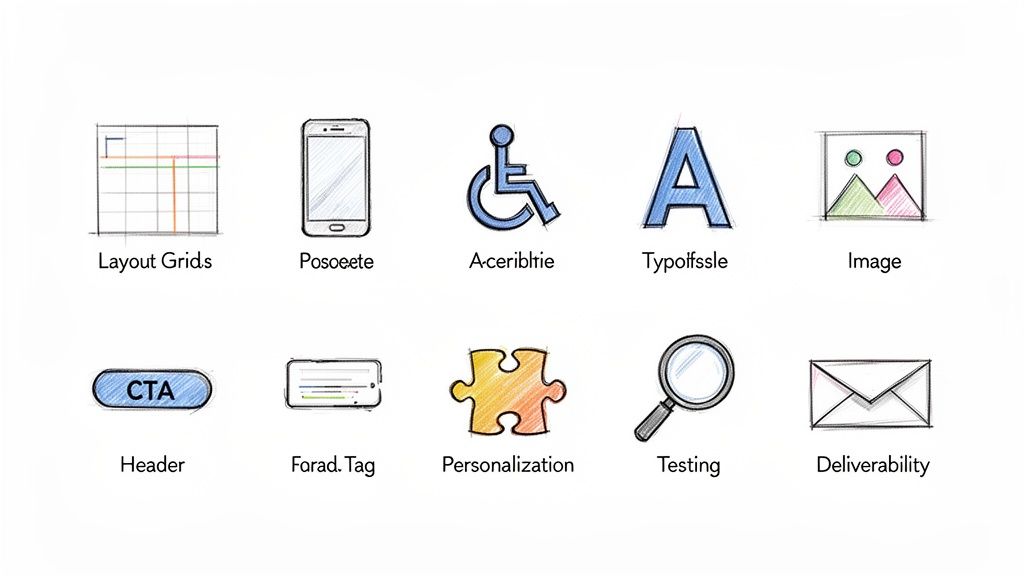
Think of each practice as a distinct, yet interconnected, part of a larger system:
Mastering this collection of email design best practices requires a dual mindset: that of a meticulous architect and a creative storyteller. It demands attention to technical detail, a deep empathy for your audience, and an unwavering commitment to your brand's core message. For entrepreneurs, leaders, and creators already juggling countless responsibilities, this can feel like an overwhelming task. The path from understanding these principles to implementing them consistently is often filled with technical hurdles, creative blocks, and the simple constraint of time.
Your email list is more than just a list of contacts; it's a direct line to the people who believe in your mission. It represents an asset you fully own, independent of unpredictable social media algorithms. By dedicating yourself to these practices, you are not just sending better emails. You are building a durable legacy of influence, one thoughtful, well-designed, and authentic message at a time. This is how you earn attention, foster loyalty, and create lasting impact.
Feeling ready to apply these principles but short on time? Legacy Builder specializes in transforming the insights of busy leaders into high-impact, authentic content, including strategically crafted emails that build real connections. We integrate these very best practices into our process to ensure your personal brand's voice is not only heard but felt. Learn how Legacy Builder can help you build your influence today.


You could – but most in-house teams struggle with the nuance of growing on specific platforms.
We partner with in-house teams all the time to help them grow on X, LI, and Email.
Consider us the special forces unit you call in to get the job done without anyone knowing (for a fraction of what you would pay).
Short answer – yes.
Long answer – yes because of our process.
We start with an in-depth interview that gives us the opportunity to learn more about you, your stories, and your vision.
We take that and craft your content then we ship it to you. You are then able to give us the final sign-off (and any adjustments to nail it 100%) before we schedule for posting.
No problem.
We have helped clients for years or for just a season.
All the content we create is yours and yours alone.
If you want to take it over or work on transitioning we will help ensure you are set up for success.
We want this to be a living breathing brand. We will give you best practices for posting and make sure you are set up to win – so post away.
Subscribe to our newsletter and get insights on how to grow your personal brand.