.svg)
Subscribe to our newsletter and get insights on how to grow your personal brand.
Thank you! Your submission has been received!
Oops! Something went wrong while submitting the form.
.svg)


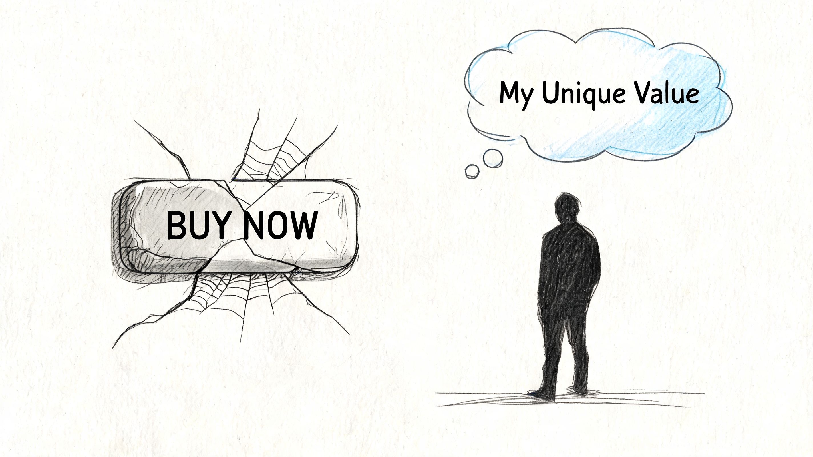
Most CTA advice is built for carts, checkout pages, and short-term conversion lifts. That's fine if you sell socks or software trials. It's bad advice if you're building a personal brand people need to trust before they buy, refer, reply, or stick around.
Founders copy e-commerce CTA tactics all the time. They slap “Book Now,” “Buy Now,” or “Limited Time” under every post, every email, every landing page. Then they wonder why engagement feels shallow and why their audience watches without committing. The problem usually isn't visibility. It's misalignment. Your audience doesn't just want a button. They want a reason to believe you.
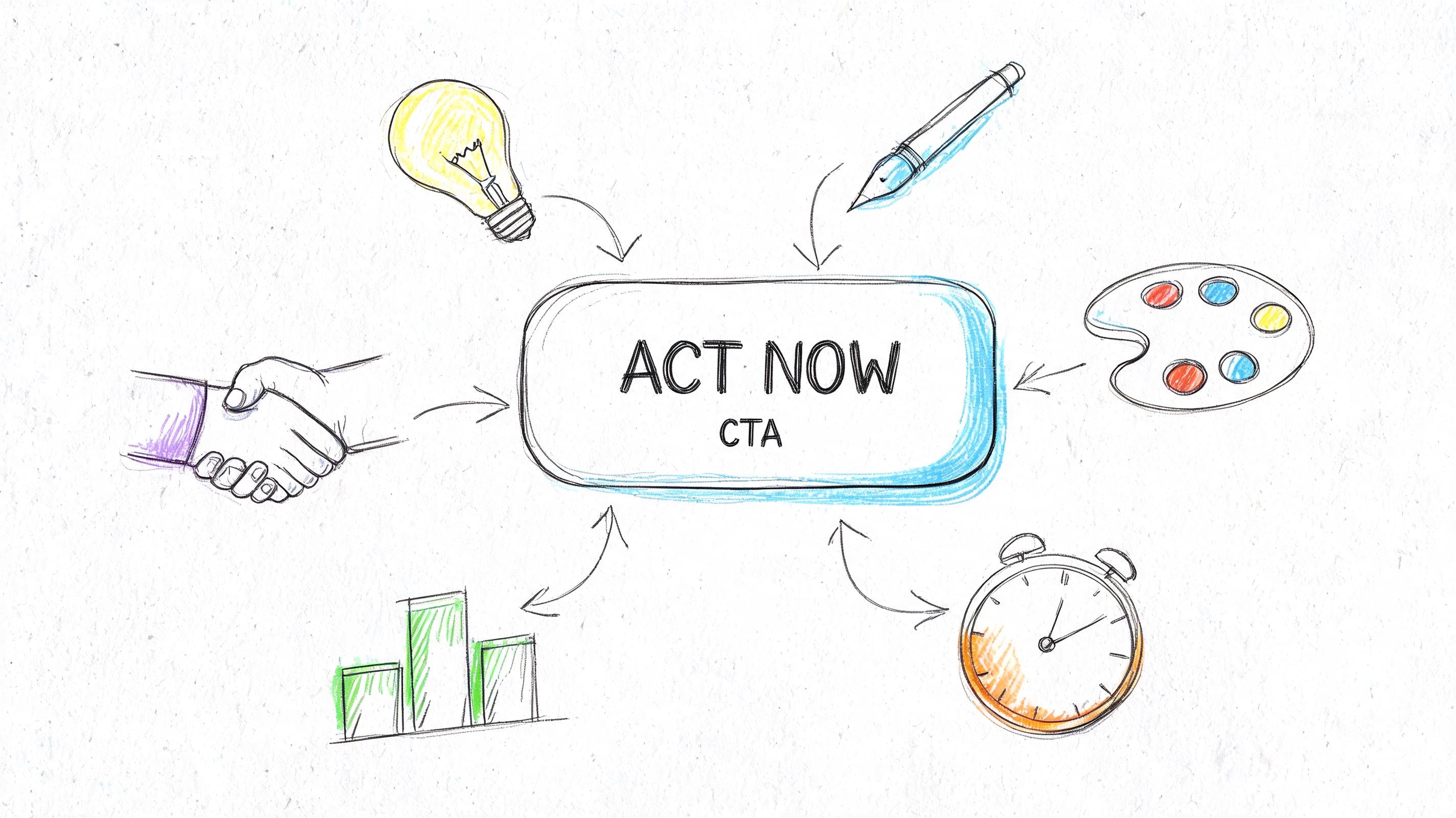
Good call to action best practices for personal brands work differently. A strong CTA should still move people forward, but it should do it without breaking trust. It should feel like the next natural step in a relationship, not a demand from someone who hasn't earned the ask.
The usual CTA playbook assumes one thing. The fastest path to action is pressure.
That logic works in transactional marketing. It falls apart in trust-based branding. One2create's analysis of CTA mistakes makes the gap clear: existing CTA best practices heavily emphasize conversion metrics and transactional language, but offer minimal guidance on CTAs designed for authentic personal branding where the goal is relationship-building rather than immediate transactions.
If you're a founder, advisor, operator, or creator, that distinction matters. People don't follow you because they want to be pushed. They follow you because they want insight, perspective, leadership, and consistency.
Every time you use a hard-sell CTA in the wrong context, you make the next ask harder.
You train your audience to expect pressure. You narrow your brand to a pitch. You make useful content feel like bait. That's why founders with solid ideas still struggle to convert warm attention into real relationships.
If your content says, “I'm here to help,” but your CTA says, “Act now before you miss out,” people feel the mismatch immediately.
A CTA doesn't just ask for action. It signals intent.
That signal matters more for personal brands than for faceless brands. People attach your CTA to your character. If it feels manipulative, they don't just ignore the button. They downgrade their trust in you.
You still need direct asks. Passive content doesn't build momentum. But your asks should match the actual stage of the relationship.
For most founders, the best CTAs are invitations like these:
These CTAs work because they respect context. They don't force intimacy or urgency before trust exists.
If your brand is built on credibility, your CTA strategy has to protect that credibility. That's the same principle behind brand authenticity and why it matters. The ask should sound like something a trustworthy person would say.
A quick filter helps. Cut CTAs that do any of these:
| Weak move | Why it hurts |
|---|---|
| Overstate urgency | It makes a thoughtful brand sound cheap |
| Ask for too much too soon | It creates friction before trust is earned |
| Use generic verbs | “Submit” and “Click here” feel cold and forgettable |
| Ignore audience temperature | A first-time reader won't respond like a loyal subscriber |
The job of your CTA isn't to squeeze action out of strangers. It's to move the right people one step deeper into your world.
A great CTA works because it reduces uncertainty.
People don't click when they feel rushed. They click when the next step feels obvious, worthwhile, and safe. That's the psychological job of a CTA. Not hype. Not tricks. Clarity.
The strongest call to action best practices for personal brands come down to three forces: relevance, ease, and expected value.
Generic CTAs underperform because they ask everyone the same thing.
That's lazy marketing. And it's expensive. Research cited by Brainiac Media on personalized CTAs found that personalized calls-to-action outperform generic ones by 202%, based on analysis of over 330,000 CTAs. The lesson is simple. People respond when the ask matches their context.
A founder speaking to early-stage operators shouldn't use the same CTA they use for enterprise buyers. A creator posting mindset content shouldn't end with the same ask used under a tactical tutorial.
Use the content itself to shape the CTA. If the post is educational, invite reflection or a deeper resource. If the post is a story, invite response. If the post addresses a specific pain point, offer the next useful step.
A CTA fails when people have to decode it.
Short, direct language wins because it lowers cognitive effort. Your audience should know three things instantly:
That's why “Get the guide” usually beats “Discover what's possible.” The second one sounds polished. The first one tells the truth.
Practical rule: If your CTA needs explanation, it's weak.
You're not writing a slogan. You're removing hesitation.
The best CTAs answer the silent question in your audience's head. “What do I get if I do this?”
That “get” isn't always a file, a demo, or a discount. In personal branding, the reward might be access, insight, belonging, progress, or clarity.
Use that openly. Don't hide the benefit behind vague language.
This is also where social proof can steady the decision. If people feel uncertain, evidence around the CTA can reduce friction. That's the broader logic behind social proof in marketing and how it builds trust. Don't overdo it. A light trust cue is enough.
Before you publish any CTA, read it out loud and ask one question.
Would a credible mentor say this in a real conversation?
If the answer is no, rewrite it.
Use this quick check:
That's the difference between asking and inviting. Strong CTAs don't corner people. They guide them.
Most weak CTAs fail at the sentence level. The offer may be solid. The design may be clean. But the words sound generic, pushy, or vague.
Your copy has one job. Make the next step feel useful.
According to KISSmetrics on CTA button best practices, action-oriented verbs can increase conversion rates by 10-30%, and benefit-framed CTAs reduce friction by shifting attention from effort to outcome. That matters because many founders still write CTAs around the platform's action instead of the audience's gain.
“Submit.” “Register.” “Contact us.” Those are system words. They describe what the form does, not what the person gets.
Not all action verbs create the same feeling.
Some verbs sound administrative. Others sound useful, enabling, or personal. Choose verbs that suggest progress, access, or ownership.
| Weak verb | Better verb |
|---|---|
| Submit | Get |
| Register | Join |
| Click | See |
| Download | Access |
| Contact | Talk |
For personal brands, the best verbs often sound like invitations instead of commands. “Join,” “get,” “see,” “explore,” and “reply” are stronger than cold corporate language because they feel relational.
A button or text link should answer, “Why this?”
Use these formulas:
Verb + clear outcome
Get the weekly playbook
Verb + audience identity
Join the founder circle
Verb + immediate value
See the content system I use
Verb + emotional payoff
Build a brand people trust
Here's the standard I use. If you can remove the CTA from the page and place it on any other website without changing a word, it's too generic.
A cold visitor doesn't want the same ask as a loyal reader.
Use this progression:
For new people
For engaged followers
For high-intent readers
That sequencing matters. Trust-based brands grow when the CTA fits the relationship stage.
Don't ask for marriage on the first date. Ask for the next honest step.
A CTA should still sound like you.
If your brand voice is sharp and plainspoken, don't switch to inflated marketing language at the moment of action. If your content feels generous and practical, the CTA should carry that same tone.
Try these examples:
If you want a fast starting point, use a custom on-brand call to action builder to generate variations, then edit heavily. Don't publish the first output. Use it to get unstuck, not to outsource your judgment.
A CTA should feel like a trusted recommendation from someone who knows what matters. That tone converts better because it respects the reader.
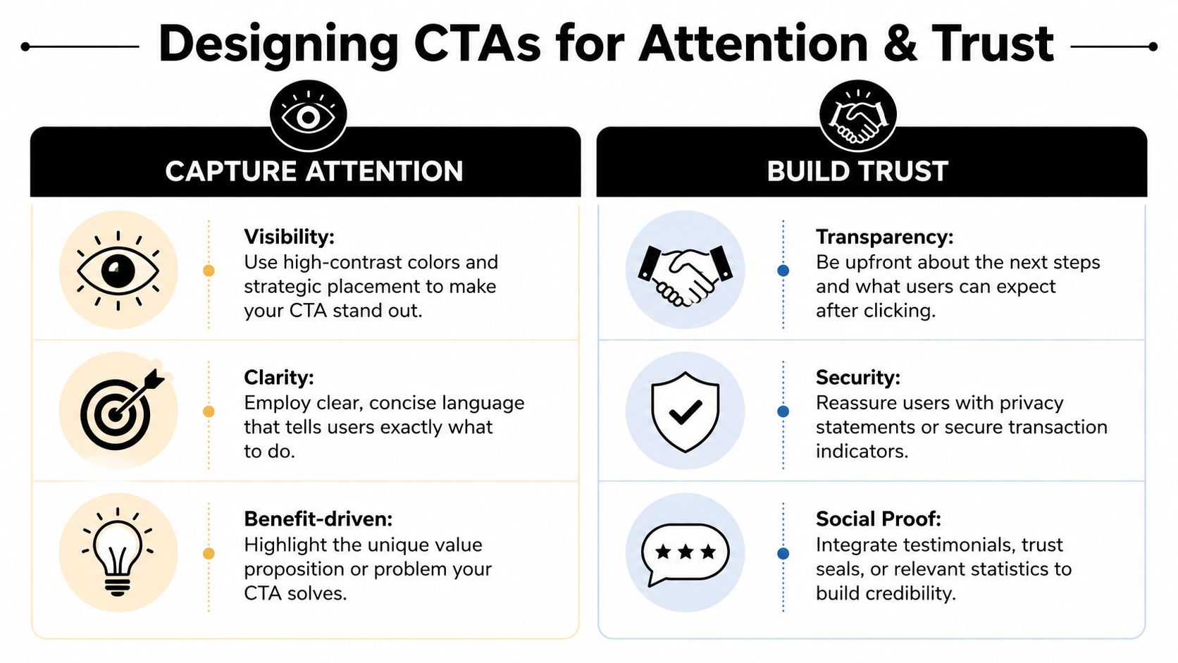
A great CTA shouldn't fight the page to get noticed. It should sit where the eye naturally lands and stand out without looking desperate.
Design influences whether people see your CTA, but trust determines whether they act on it. You need both.
Heatmap.com's CTA analysis reports that contrasting CTA button colors and strategic placement can drive 20-50% higher click-through rates, and that humans process color contrasts in less than 0.1 seconds, with high luminance differences capturing 42% more fixations. That's not a license to make your page ugly. It's a reminder that visibility is a design responsibility.
Founders often hide their CTA inside a polished layout. Everything looks elegant. Nothing stands out.
Fix that with basic discipline:
A CTA doesn't need to scream. It needs to be obvious.
People hesitate when a page feels messy, overly aggressive, or vague about what happens after the click.
That's why trust design matters. The strongest CTA area usually includes a few supporting cues:
Clean design signals competence. Competence makes the click feel safer.
This matters even more for founders selling expertise. If your page looks improvised, people question your process.
A personal brand CTA should feel native to the brand itself.
If your visual identity is calm, premium, and deliberate, don't drop in a neon button that looks like a casino ad. Yes, contrast matters. But contrast should still live inside your brand system.
Use this simple comparison:
| Design choice | Effect |
|---|---|
| High contrast, brand-aligned | Strong visibility with retained credibility |
| Oversized, off-brand button | Attention with reduced trust |
| Minimal button with no hierarchy | Elegant look, weak response |
| CTA plus clear reassurance | Better confidence at the moment of action |
Good CTA design feels intentional. The visitor notices the action because you guided their attention, not because you yelled.
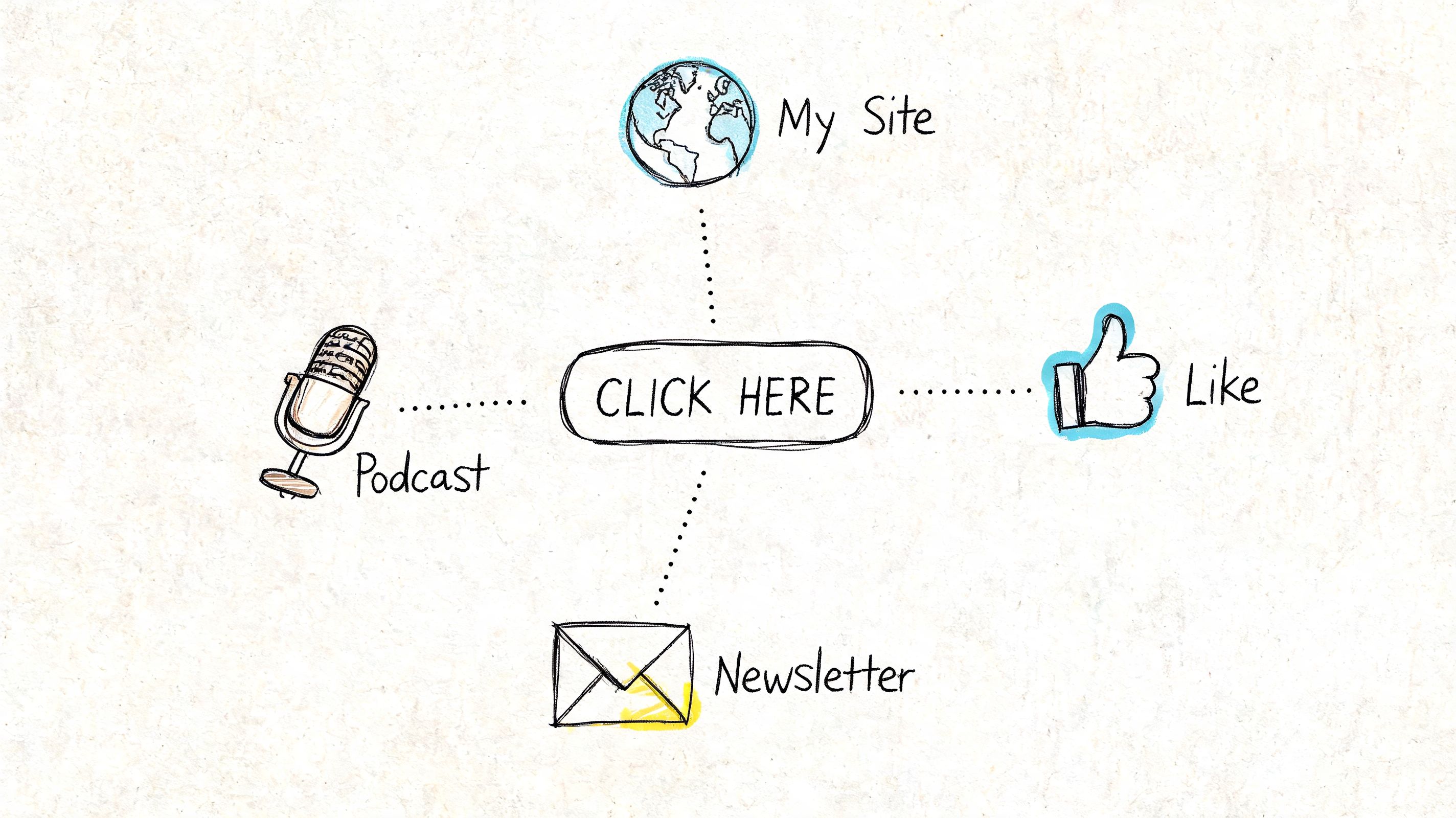
A CTA that works on a landing page can fail on LinkedIn. An email CTA that gets clicks can sound awkward in a podcast description. Context changes the ask.
That's where most founders get sloppy. They write one CTA and paste it everywhere. Don't do that. Platform behavior shapes CTA performance.
Protocol 80's CTA best practices found that emails with one clear CTA see 371% higher click-through rates than emails with multiple options, social media ads with clear CTAs see 285% higher click-through rates, and placing a CTA above the fold on a webpage yields 84% more engagement. The implication is simple. Clarity and placement matter, but they need to be adapted to the environment.
Email is where founders often overcomplicate things. They add a main link, a secondary offer, three text links, a podcast plug, and social icons. Then they wonder why nobody clicks.
Use one core CTA per email when the goal is action. Not five.
A strong email CTA usually appears after you've done one of these well:
Then make one direct ask. Examples:
That kind of focus is one reason dedicated pages like a personal brand landing page tend to convert better than scattered website paths. Fewer choices. Clearer intent.
On social media, the best CTA often isn't “buy.” It's “engage.”
That means asking for a small action that deepens the relationship:
If you use Facebook as part of your mix, Publer has a practical walkthrough on improving Facebook posts with action buttons. Use tools like that to make the platform-native button support your message instead of replacing it.
A website CTA shouldn't appear only once.
Place CTAs where motivation naturally rises:
| Website location | Best kind of CTA |
|---|---|
| Hero section | Clear primary action for ready visitors |
| Mid-article | Contextual next step tied to the topic |
| End of article | Relationship-building ask or deeper resource |
| Sidebar or sticky area | Light reminder, not a second sales pitch |
The right CTA at the wrong moment still underperforms.
Your homepage, blog, and about page all attract different intent levels. Match the ask to that intent. Someone reading your ideas may want to subscribe. Someone reading your services page may want to talk. Don't flatten those into one generic button.
Most founders treat CTAs like final copy. They write one, approve it, and move on.
That's a mistake. CTA performance is discovered through testing, not opinion. You don't need a growth team to do this well. You need a clean process and enough patience to learn.
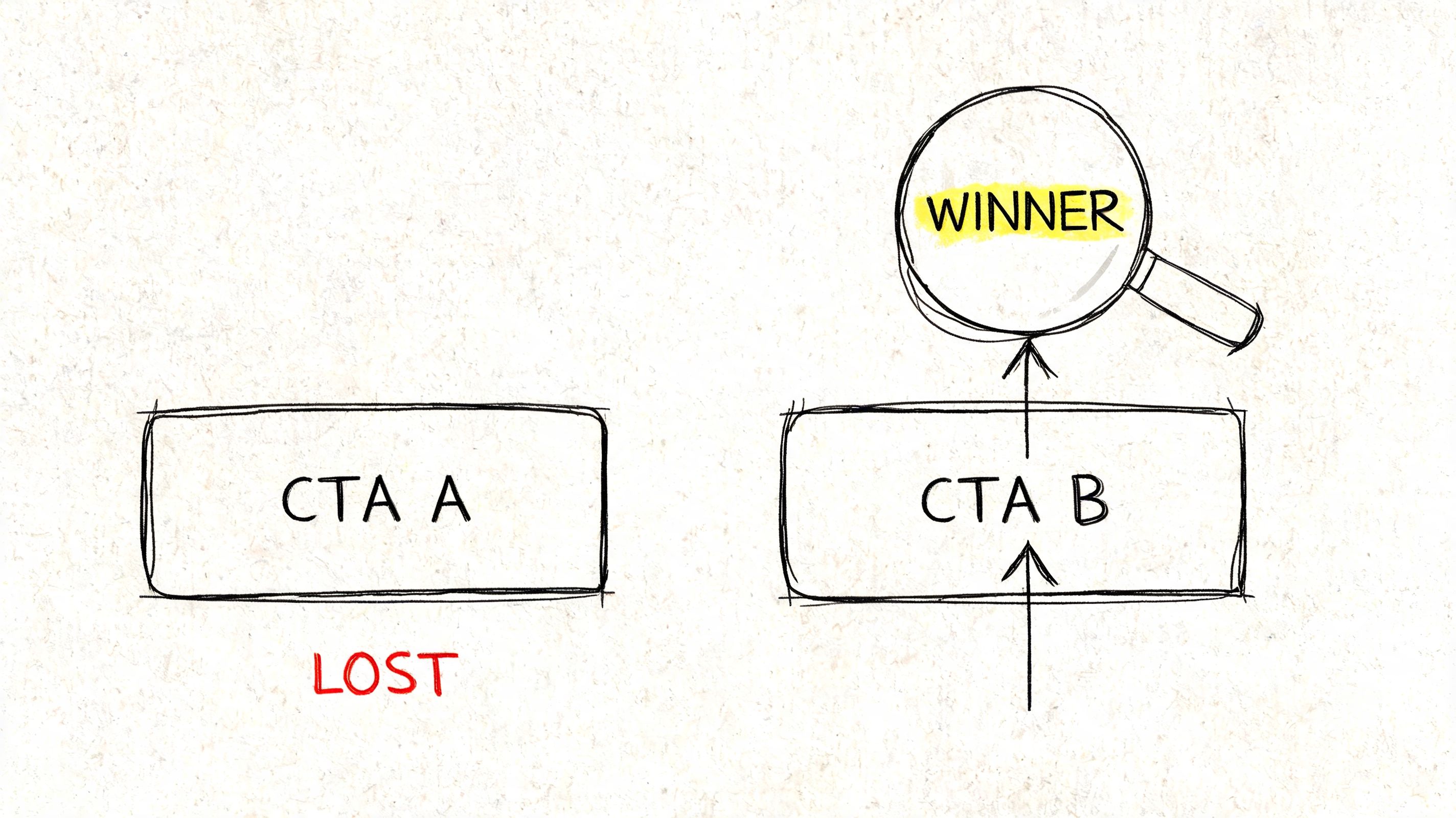
If you change the copy, color, placement, and surrounding text all at once, you learn nothing useful.
Keep your tests simple. Pick one variable.
Try comparisons like these:
That's enough. One controlled change will tell you more than five dramatic edits.
Clicks matter, but they're not the whole story.
A CTA can get lots of clicks and still attract the wrong people. For personal brands, quality matters. Watch what happens after the click. Do people reply, subscribe, book, stay engaged, or disappear?
Use a simple scorecard:
| Metric | What it tells you |
|---|---|
| Click-throughs | Whether the CTA gets attention |
| Replies or comments | Whether the ask sparks real engagement |
| Qualified inquiries | Whether the CTA attracts the right people |
| Downstream action | Whether trust continues after the click |
If your CTA increases clicks but lowers conversation quality, that isn't a win. It means the CTA overpromised or invited the wrong intent.
You don't need enterprise software to improve. Tools like Google Optimize may come and go, but the operating principle stays the same. Run one test, document the result, keep the winner, and test the next thing.
Use this monthly rhythm:
If you want more practical CRO reading, BuildForm curates useful ideas under more from BuildForm. Use resources like that to sharpen your testing habits, not to chase gimmicks.
The point isn't endless optimization. The point is clarity. Testing shows you how your audience prefers to move.
The best CTA is rarely the cleverest one. It's the one your audience trusts enough to follow.
A short walkthrough can help if you want to sharpen the habit with visuals and examples.
If your CTAs feel weak, start here:
That order matters. Don't start with button color if the offer is unclear. Don't obsess over placement if the ask itself feels premature.
Strong call to action best practices aren't about gaming people into clicks. They're about making the next step feel so relevant and trustworthy that the right people want to take it.
A CTA for Legacy Builder. If you're done posting strong ideas with weak asks, get help turning your expertise into content that earns trust and moves people to act.


You could – but most in-house teams struggle with the nuance of growing on specific platforms.
We partner with in-house teams all the time to help them grow on X, LI, and Email.
Consider us the special forces unit you call in to get the job done without anyone knowing (for a fraction of what you would pay).
Short answer – yes.
Long answer – yes because of our process.
We start with an in-depth interview that gives us the opportunity to learn more about you, your stories, and your vision.
We take that and craft your content then we ship it to you. You are then able to give us the final sign-off (and any adjustments to nail it 100%) before we schedule for posting.
No problem.
We have helped clients for years or for just a season.
All the content we create is yours and yours alone.
If you want to take it over or work on transitioning we will help ensure you are set up for success.
We want this to be a living breathing brand. We will give you best practices for posting and make sure you are set up to win – so post away.
Subscribe to our newsletter and get insights on how to grow your personal brand.