.svg)
Subscribe to our newsletter and get insights on how to grow your personal brand.
Thank you! Your submission has been received!
Oops! Something went wrong while submitting the form.
.svg)


Before you touch a single color palette or font, you have to get to the heart of your brand. This is the foundation—the soul of your operation—and honestly, it's the most important work you'll do. It’s the “why” behind every single creative choice you make down the line.
When you nail this strategy first, your brand has substance. Every element feels authentic and connected, not just a random collection of cool-looking stuff. It stops you from making arbitrary choices, like picking a color just because it's trendy. Instead, you'll choose one that perfectly captures the emotion tied to your mission. You'll stop writing copy that just sounds clever and start speaking in a voice that your audience actually wants to hear.
Let's get into the weeds. Building a solid foundation means getting crystal clear on a few key things before you even think about design.
Your purpose, mission, and vision statements aren't just fluffy corporate jargon. They’re your guiding principles—your brand's North Star.
Getting these right gives you a filter for every single decision, making sure you never stray from what you stand for.
Here's a hard truth: you can't build a brand for everyone. The best brands connect with a very specific group of people on an emotional level. To do that, you need to go way beyond basic demographics like age and location.
You have to dig into their psychographics—their values, their dreams, their biggest frustrations.
Audience research doesn't have to be complicated. Just interview five to ten of your ideal customers or send a quick survey to your email list. Ask open-ended questions to get them talking. What keeps them up at night? What brands do they absolutely love and why? Where do they hang out online? The answers you get are pure gold for shaping a brand that feels like it was made just for them.
This process is a clear-cut path: define your purpose, understand your audience, and then, and only then, can you craft your story.
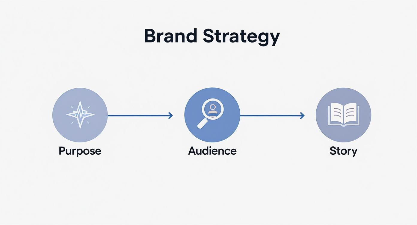
As you can see, a powerful brand story is built on the bedrock of a clear purpose and a deep understanding of who you're talking to.
Your brand story isn't just a timeline of your company's history. It’s the narrative that weaves your purpose, mission, and values into something people can actually connect with. The secret? Make your customer the hero of that story.
Once you have your story, your positioning statement carves out your unique space in the market. Think of it as an internal compass. It clearly states who you serve, what you do, and what makes you the only logical choice.
Here’s a simple formula to get you started: For [target audience], [your brand] is the [category] that provides [key benefit/differentiator].
Don't just take my word for it. The data shows that brands with clear guidelines build more trust and make more money. A massive 46% of consumers are willing to pay more for brands they trust, and consistency is key to building that trust. On top of that, 68% of consumers say brand stories heavily influence their buying decisions.
Before you dive into the design phase, let's recap the strategic cornerstones you need to define.
These are the essential building blocks to define before you start designing your brand guidelines.
With these strategic pieces locked in, you have a solid foundation to build a memorable and meaningful brand.
Ultimately, this foundational work ensures that every piece of your brand works together. To make sure you’re building a single source of truth for your entire team, I highly recommend following a step-by-step guide on how to create brand guidelines. And if you're looking to see how this fits into your bigger business plan, checking out some https://www.legacybuilder.co/blog/business-model-canvas-examples-to-inspire-your-strategy can give you a great framework.
Alright, you've laid the strategic groundwork. Now for the fun part: giving your brand a face. This is where we translate all that purpose, personality, and positioning into a visual system that people can see, feel, and remember.
This isn't just about picking pretty colors or a cool logo. We're building a complete visual toolkit. One that’s flexible enough for any situation but consistent enough to become instantly recognizable.
Think about it: just using a signature color can boost brand recognition by a massive 80%. Your visual system is the rulebook that makes that happen, every single time.
Your logo is the most concentrated version of your brand. It's your visual handshake, and you have to protect it at all costs. This means your guidelines need to be brutally clear about how to use it—and more importantly, how not to.
If you leave any room for interpretation, I promise you, you’ll see your logo stretched, squashed, or slapped on some hideous, low-contrast background. It slowly chips away at all the recognition you're trying to build.
Start with the non-negotiables:
Think of these rules as the security detail for your brand's most valuable asset.
Color hits people on an emotional level, so your palette needs to be more than just a few shades you like. A truly functional palette is a strategic system that guides every single design choice, from a website's CTA button to the embroidery on a company polo.
To build a robust system, you need to define each color's job:
Pro Tip: Don't just show a color swatch and call it a day. That’s lazy. You must list the exact color codes for every medium: HEX for web, RGB for digital, and CMYK and Pantone for print.
This is how you ensure your brand's signature blue looks identical on a landing page and a printed brochure. No guesswork allowed.
The fonts you choose broadcast your personality. Are you a sleek, modern tech brand or a timeless, authoritative consulting firm? Typography is your brand's voice, made visible.
A classic mistake I see all the time is using too many fonts. It just creates visual noise. Keep it simple and build an effective hierarchy:
Your guidelines should get specific, spelling out which font weights and sizes to use for H1s, H2s, body text, and so on. This creates a smooth, consistent reading experience no matter where someone is reading your content. The goal is a system that's both expressive and easy on the eyes.
Your photos and graphics are what tie the entire visual story together. If your guidelines are vague here, you'll end up with a random collection of stock photos that feel disconnected and cheapen your brand.
You need to define the world your brand lives in.
When you define this style, any designer or photographer you work with can create visuals that feel like they came from a single, cohesive vision. That’s how you build a brand that’s not just seen, but remembered. And when you're ready to put that powerful visual presence to work, you can learn more about building high-impact brand showcases on our landing page.
How you say something is often more important than what you say. Think of your brand's voice as its personality translated into words. It’s what turns a simple transaction into a real relationship with your audience.
A consistent voice makes your brand feel human—like someone they can trust. When everyone on your team, from the social media manager to a customer service rep, sounds like they're coming from the same place, you build that trust. It’s the difference between being a trusted friend and just another faceless company.

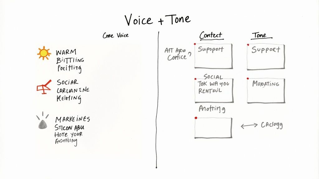
Before we go any further, we need to clear up a common mix-up: voice is not the same as tone. I see people get this wrong all the time, and it leads to a brand that feels all over the place.
Here’s the simplest way to think about it:
The goal is to lock in a stable voice, then teach your team how to adjust the tone for different scenarios. Get this right, and you’re golden.
Here’s where you need to get specific. Vague words like "friendly" or "professional" are basically useless. They don't give your team anything to work with.
Instead, pick three to five strong, descriptive adjectives that really capture your brand’s personality. For example, instead of just "helpful," you could go with "reassuring, clear, and empowering." See how much more direction that gives?
A simple exercise I love is the "We are X, but not Y" framework. It creates sharp, easy-to-follow boundaries. For example: "We are confident, but not arrogant." Or, "We are playful, but not silly."
Once you have these attributes, you’ve got the foundation. Now, it's time to show your team what this actually looks like in practice.
This is where the theory becomes reality. A voice chart is a simple table that translates those abstract words into real-world examples. It's a "say this, not that" guide that takes all the guesswork out of writing.
Let’s say we’ve defined a brand's voice as Expert, Empathetic, and Action-Oriented. Here’s what their chart might look like:
This chart is one of the most valuable assets you can include in your brand guidelines. It empowers everyone on your team to write with consistency and confidence.
When done right, a well-defined voice becomes a massive asset—especially when it’s part of a modern B2B social media strategy that works. It ensures you sound authentic and authoritative on every single platform, which is exactly what you need to engage a professional audience and build a lasting brand.
So, you’ve done it. You have a shiny, comprehensive brand guidelines document. It’s a work of art, detailing your brand’s entire visual and verbal identity. But let's be real for a second: a brand guide that just collects digital dust in a forgotten folder is completely useless.
Its real power is only unleashed when it's actively used across every single place someone bumps into your brand. This is where the theory ends and the work begins. It’s all about turning those abstract rules into real-world, consistent experiences. Every detail counts—from the color of a button on your website to the way you sign off a customer support email.
Your website and social media profiles are your brand’s front door. This is often the very first impression you make, and consistency here is non-negotiable. It’s how you build instant trust and make your brand memorable.
This means applying your guidelines to every digital element, no matter how small it seems. Your website isn’t just a place to slap your logo in the header. Every component needs to feel like it belongs to the same family.
Social media is another battleground for consistency. Every platform has its own quirks, but your brand’s core identity has to cut through the noise. This means creating channel-specific templates that bake your rules right in. An Instagram post template, for instance, should lock in your fonts and colors, while a LinkedIn banner should use your logo with the proper clear space.
Even in our digital-first world, physical materials still pack a punch. They offer a tangible connection to your brand, and when they look off-brand, it’s especially jarring.
From business cards to trade show banners, your brand guidelines have to be the single source of truth for their design. A business card is a perfect example—it's a tiny test of brand discipline. It has to use the correct logo, approved fonts, and the right color palette. There's zero room for "creative" interpretations here.
Think about these common offline materials:
A brand isn't built in a day; it's built in a thousand consistent moments. When your team has a clear roadmap, they can execute with confidence, turning guidelines into a unified brand experience.
The true test of your guidelines is whether they empower your team to adapt the brand for different situations without breaking it. Let’s take just one element—your primary color—and see how it should be applied correctly everywhere.
This systematic approach is what separates the strong brands from the forgettable ones. And it has a real financial impact. Studies show that 32% of companies report that consistent messaging and branding increase their revenue by more than 20%. On platforms like YouTube, it's even more direct, with 40% of viewers making a purchase after seeing a consistent brand presence.
But here’s the kicker: only about 25% of companies actually enforce their brand guidelines, leaving a massive opportunity on the table for those who do. You can dive deeper into how this impacts revenue in this detailed analysis from Digital Silk.
Ultimately, applying your guidelines is a continuous process of education, execution, and reinforcement that turns your brand strategy into a living, breathing reality.

Let’s be real. You can create the most beautiful, comprehensive set of brand guidelines in the world, but if nobody uses them, they’re worthless.
The real win isn't finishing the document—it's getting your team to actually adopt it. A guide that collects dust on a server is a massive waste of effort. This final piece of the puzzle is all about turning your rulebook into a living, breathing part of your company culture.
Your goal is to make using the brand guidelines the path of least resistance. It should be easier for your team to grab the correct logo or presentation template than to whip up their own version. Get this right, and brand consistency stops feeling like a chore and becomes a natural part of everyone's daily workflow.
Your brand guidelines deserve more than just a quiet email with a PDF attachment. Treat this like an internal product launch.
Get everyone together for an all-hands meeting or a dedicated workshop to walk them through the new guide. This is your shot to build excitement and explain the why behind the rules. Don't just read rules off a slide—show them in action. Demonstrate how the new color palette works in a real design or how the new voice guidelines transform a bland customer email. Context is everything if you want buy-in.
The best brand guidelines aren’t just a set of rules; they’re a tool for empowerment. They give your team the confidence and resources to represent the brand accurately and creatively, every single time.
This is a bigger deal than you might think. A shocking number of companies fumble the rollout. Only about 30% of brands make their guidelines widely accessible and used across their organizations. This leads to chaos—with 77% of companies admitting to publishing off-brand content that slowly chips away at their brand equity.
If you want to dig into the data, check out these must-know branding statistics from Our Own Brand. Proper training is your first line of defense.
You have to stop the madness of people digging through old emails and random shared drive folders for the "latest version" of the logo. Your brand guidelines and all the assets that go with them need a single, easy-to-find home.
This could be a dedicated section on your company intranet, a Notion page, or a cloud-based brand management tool. Whatever you choose, it needs to be organized and dead simple to use.
To make sure your guidelines stick, you need a simple governance system. This doesn't mean creating a rigid, bureaucratic nightmare.
A great way to handle this is by appointing "brand champions" in different departments—marketing, sales, product, you name it.
These people become the go-to experts for their teams. They can answer quick questions, give feedback on new materials, and gently nudge colleagues back on track if they see something that’s off-brand. It's a decentralized approach that creates shared ownership and makes brand governance feel like a team effort.
Honestly, this might be the single most effective way to drive adoption: make it painfully easy for people to do the right thing.
Create a library of pre-made, on-brand templates for the most common things your team creates every single day.
Think about what they actually need:
When a sales manager can grab a polished, on-brand presentation deck in seconds, they have zero reason to go rogue. You’re not just enforcing rules anymore—you’re actively helping your team work faster and better. That’s how you turn a restrictive document into a valuable resource people actually want to use.
https://www.youtube.com/embed/0SKnn69QR3Y
Even with a solid plan, creating brand guidelines always brings up a few questions. I've been there. Let's walk through some of the most common ones I hear to help you sidestep any roadblocks and build a guide that your team will actually use.
There’s no magic one-size-fits-all answer here. It really boils down to where your brand is right now.
A new startup can get by just fine with a simple one-pager. We're talking the absolute essentials: logo usage, core colors, and the main fonts. It's lean, fast, and gives you exactly what you need to get going.
On the other hand, a global corporation needs a much heavier playbook. Their guide has to cover everything from product packaging and in-store displays to video end-cards and internal PowerPoints. It's a different beast entirely.
My advice? Start with what you need for consistency today.
A good rule of thumb is to nail down the non-negotiables first: your logo, color palette, typography, and voice. You can always build on it as you grow and your team starts asking new questions.
This is a big fork in the road. If you don't have a background in design or brand strategy, hiring a professional is one of the smartest investments you can make. An experienced designer or a branding agency brings that deep strategic thinking that turns a good brand into a great one.
They'll help you dodge common mistakes, like picking a color palette that looks terrible in print or choosing a font that’s unreadable on a phone. For a deeper dive into what that professional process looks like, this article on How to Create Brand Guidelines is a fantastic resource.
Sure, DIY tools are out there. But a pro delivers a guide that’s more robust, flexible, and effective—potentially saving you from a confusing and expensive rebrand down the line.
Think of your brand guidelines as a living document, not something carved in stone.
You should plan to give them a thorough review at least once a year. This is your chance to make sure they still line up with your business goals and where you sit in the market.
Big overhauls usually happen when there's a major business shift—a full rebrand, a huge product launch, or a new strategic direction for the company.
But don't wait for a major event to make small tweaks. Adding new social media templates, refining your brand voice based on customer feedback, or adding a secondary color are all routine updates. These small changes are what keep your guidelines relevant and genuinely useful for your team.
At Legacy Builder, we specialize in turning your unique story into a powerful, consistent personal brand. If you're ready to build a lasting impact with content that truly reflects you, let's connect.


You could – but most in-house teams struggle with the nuance of growing on specific platforms.
We partner with in-house teams all the time to help them grow on X, LI, and Email.
Consider us the special forces unit you call in to get the job done without anyone knowing (for a fraction of what you would pay).
Short answer – yes.
Long answer – yes because of our process.
We start with an in-depth interview that gives us the opportunity to learn more about you, your stories, and your vision.
We take that and craft your content then we ship it to you. You are then able to give us the final sign-off (and any adjustments to nail it 100%) before we schedule for posting.
No problem.
We have helped clients for years or for just a season.
All the content we create is yours and yours alone.
If you want to take it over or work on transitioning we will help ensure you are set up for success.
We want this to be a living breathing brand. We will give you best practices for posting and make sure you are set up to win – so post away.
Subscribe to our newsletter and get insights on how to grow your personal brand.